Over the past few months, I have had the privilege of working with the game studio Unexpected Accessories as a UI Artist. My main focus was to help reskin and recreate various parts of the UI of their Math Educational video game called Addie Shen!
The first step towards working on the overall design was to create a moodboard. I wanted to create something vibrant, reminiscent of a lot of Nintendo games and their UI Design, while also staying true to the overall Addie Shen design language. Any UX/UI project always starts with a Moodboard, so I put one together!
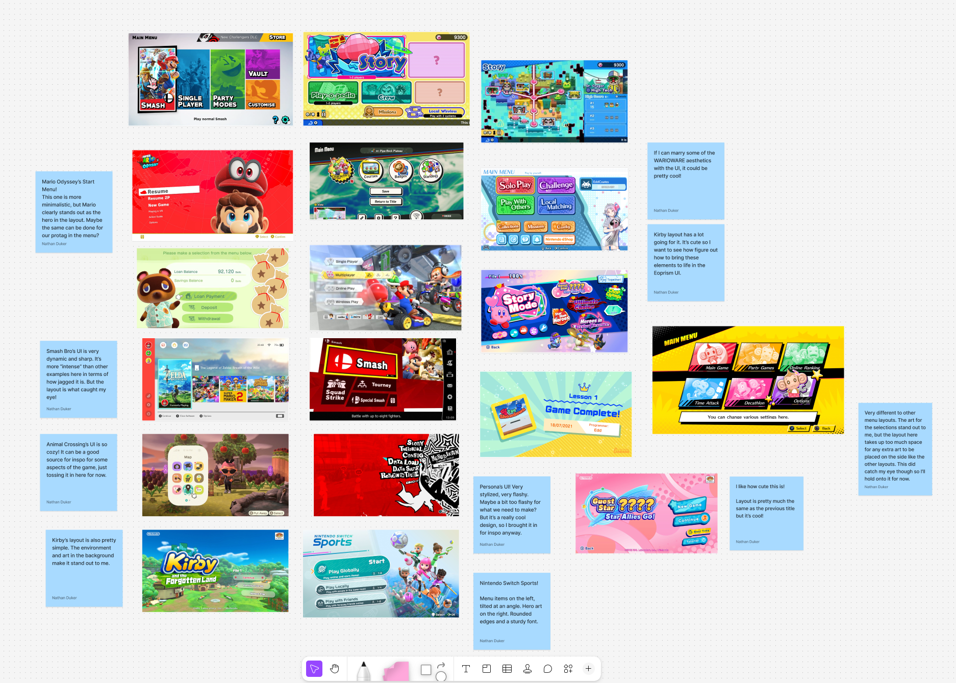
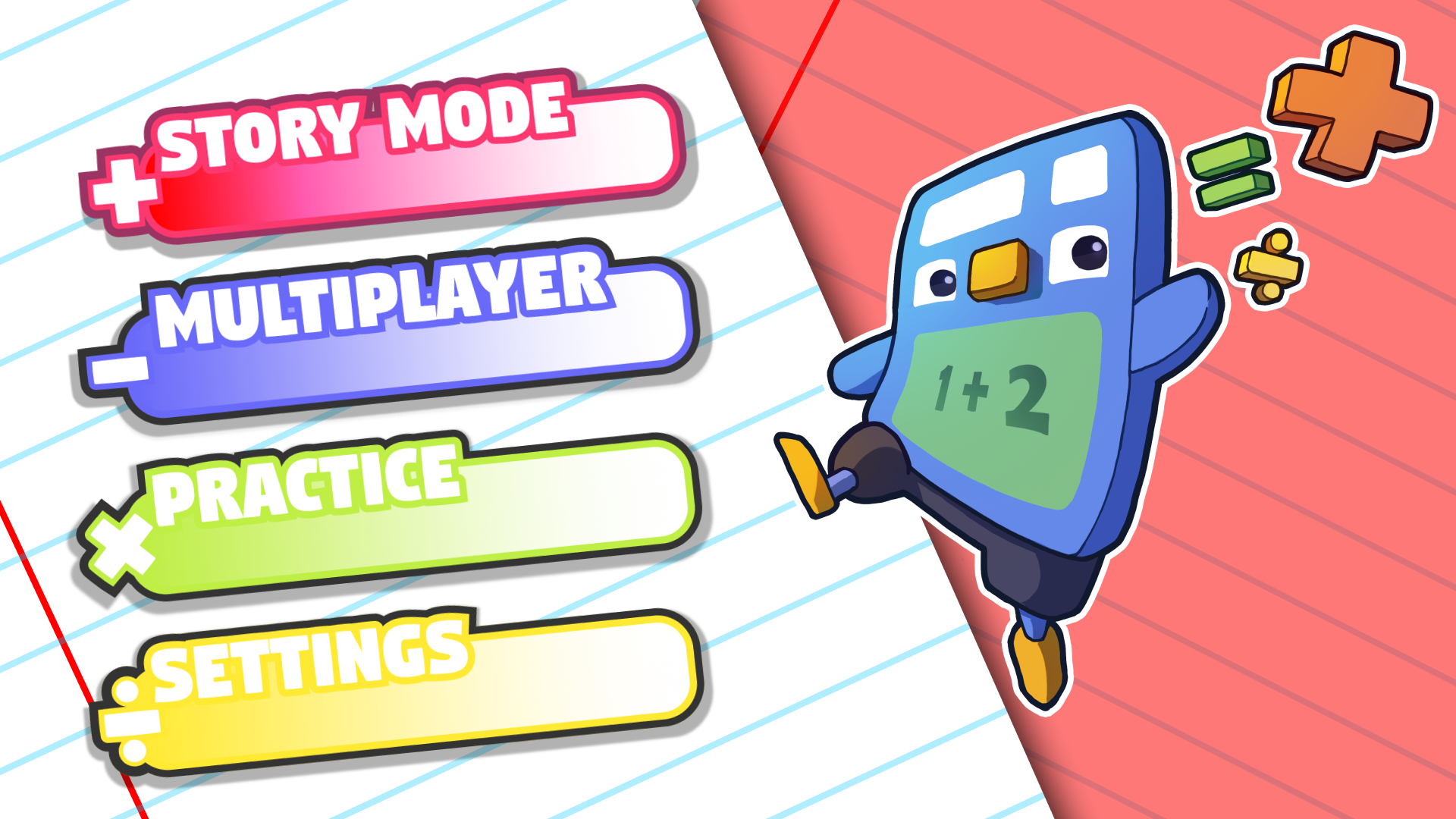
The game's Main Menui design takes some inspiration from a plethora of video games. I spent some time looking at Mario Kart, Smash, Kirby, Warioware, to name a few. In trhe image above, you'll see my notes and thoughts on why each of these UI designs interested me. The main goal was to try and settle on a design that was vibrant but also functional, nnot cluttered. Asfter spending quite some time gathering reference, it was time to make layouts and basic mockups of what the main menu would look like.
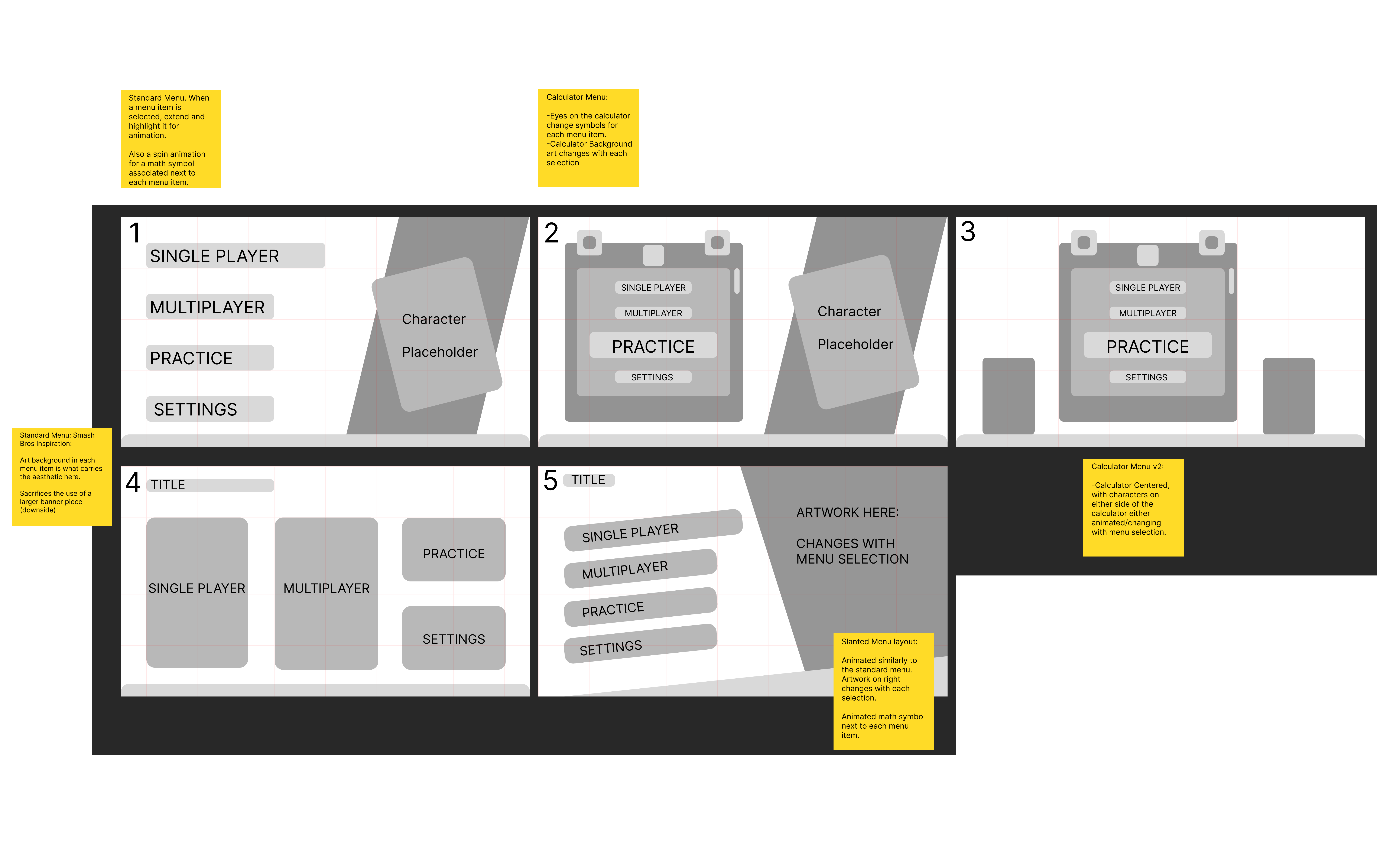
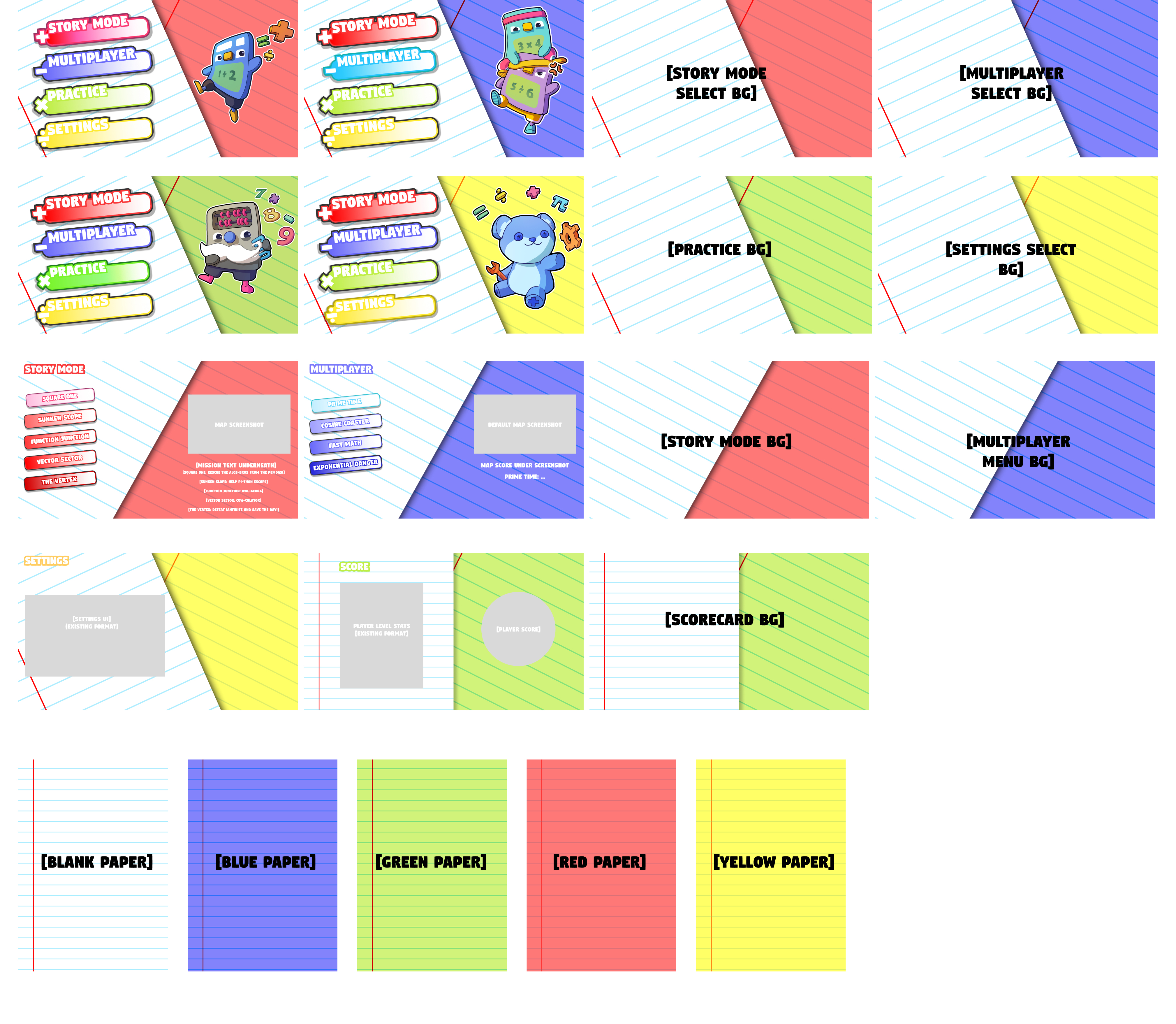
Creating the mockups, I tried to make as diverse of an option pool as was possible. Looking at the different layouts from the references, I wanted to see what would work best in our case. I was briefed to try and keep the layout clean and simple. As such, after review with the team. we opted on settling for option 5, the slanted menu. The layout there is dynamic, and the slanted design does give it a sleek feel that works for the project. Once we had decided on which layout we wanted to go for, the next step was to start updating the wireframe with the Art assets produced by the studio artist, as well as the UI assets created by me (Button Designs and Backgrounds)
For the initial design phase for the buttons, I knew I wanted to create an animated button that moved with some mathematical symbol attached to it. I initially thought I would creater the button in figma, send it over to Lottie Labs for animation and test it out that way. Below is the result that I got when I experimented with that process:
After some initial feedback, I was told that the buttons should be a bit simpler, and instead of being fully animatied should just come with 3 states: Idle, Hover and Pressed. Making sure those transitions would work would be handled by our UI Engineer who would go on to implement my assets in the game engine Godot. As such, it was back to the drawing board.
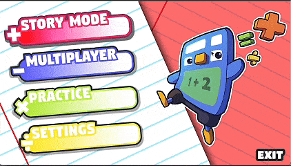
I spent quite a bit of time recreating the buttons, their different states and the UI backgrounds. We had agreed that we wanted the main menu to be somewhat reminiscent of the old one, with school paper as the background and buttons that are reminiscent of the Logo. In total, this had me create well over 100 files that I had to share wityh the dev team to get them implemented in engine.


.png)


.svg)
.png)
